Ancoats House
Branding

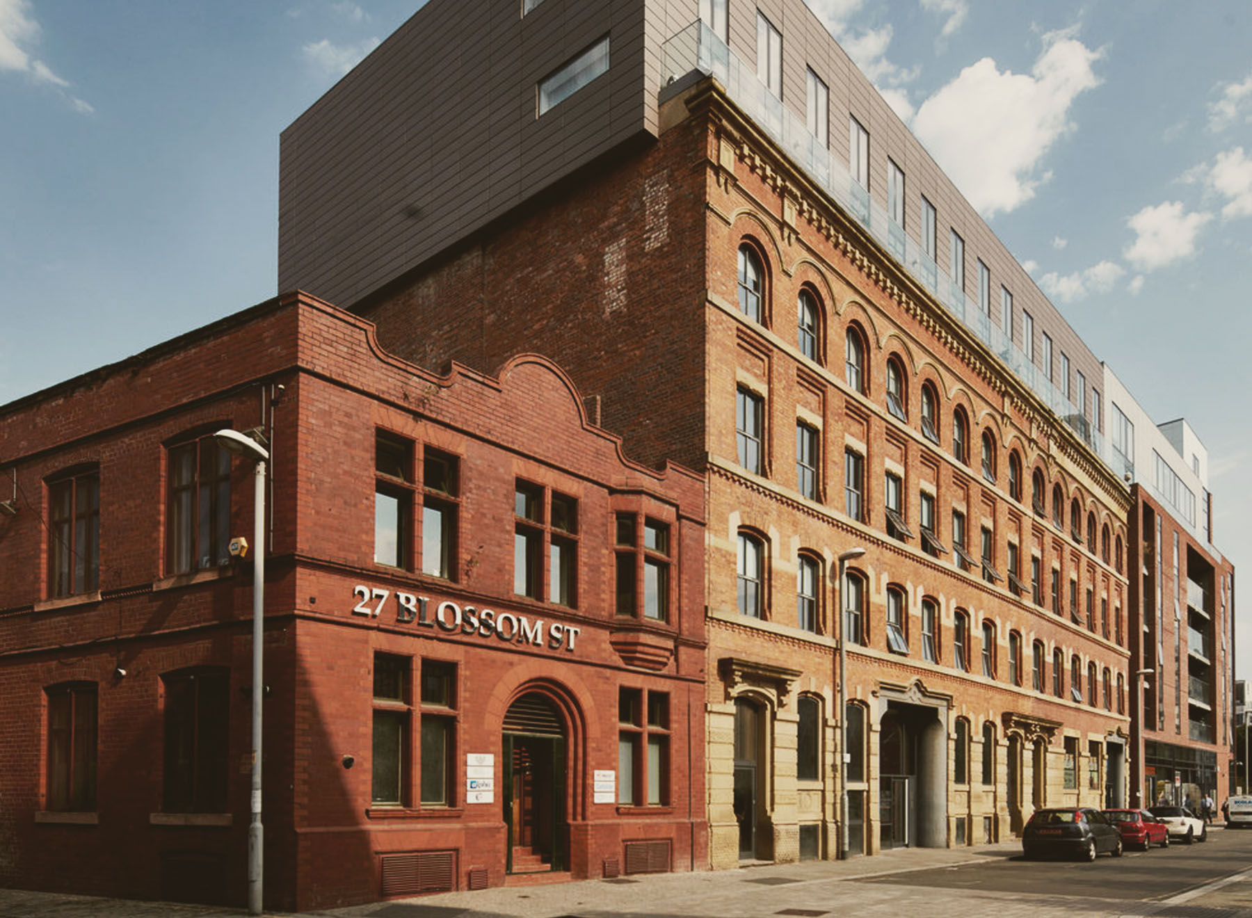
To create a logo and branding for new up and coming social space consisting of a co-working area, coffee shop, event space, open air cinema and rooftop garden. A social gathering place where you can work, play and relax. It needed to match the industrial feel of Ancoats in central Manchester aswell as have a reference to the Art Deco styling of the building itself.


The Result
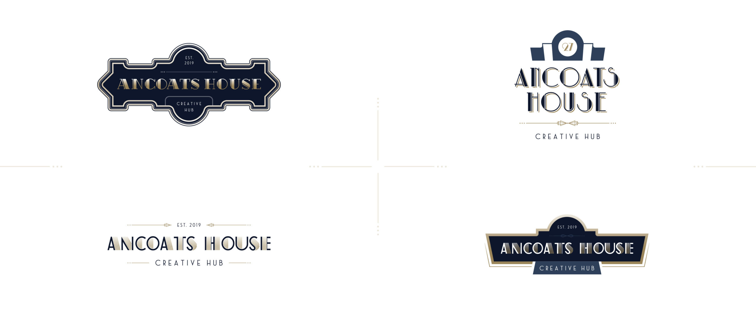
After presenting a few different concepts I ended up with a combination of two favourite concepts chosen to for the final version you see now. The number of the building was “27” so that was heavily incorporated into he design as well as being a nice touch to use that as a brand mark when the full logo wasn’t being used, for example on all their social media platforms. The shape of the logo comes from the shape of the top of the building and uses a mix of stylised typography that has been layered to give a 3D effect. The gold gradient detailing gives it a very rich feel that Art Deco is known for along with bold geometry and ornamental styling that was used in this final logo as well as in some of the earlier concepts. This gold gradient would be foiled in any printing materials or signage.

