Caspian Insurance
Branding & Website Design
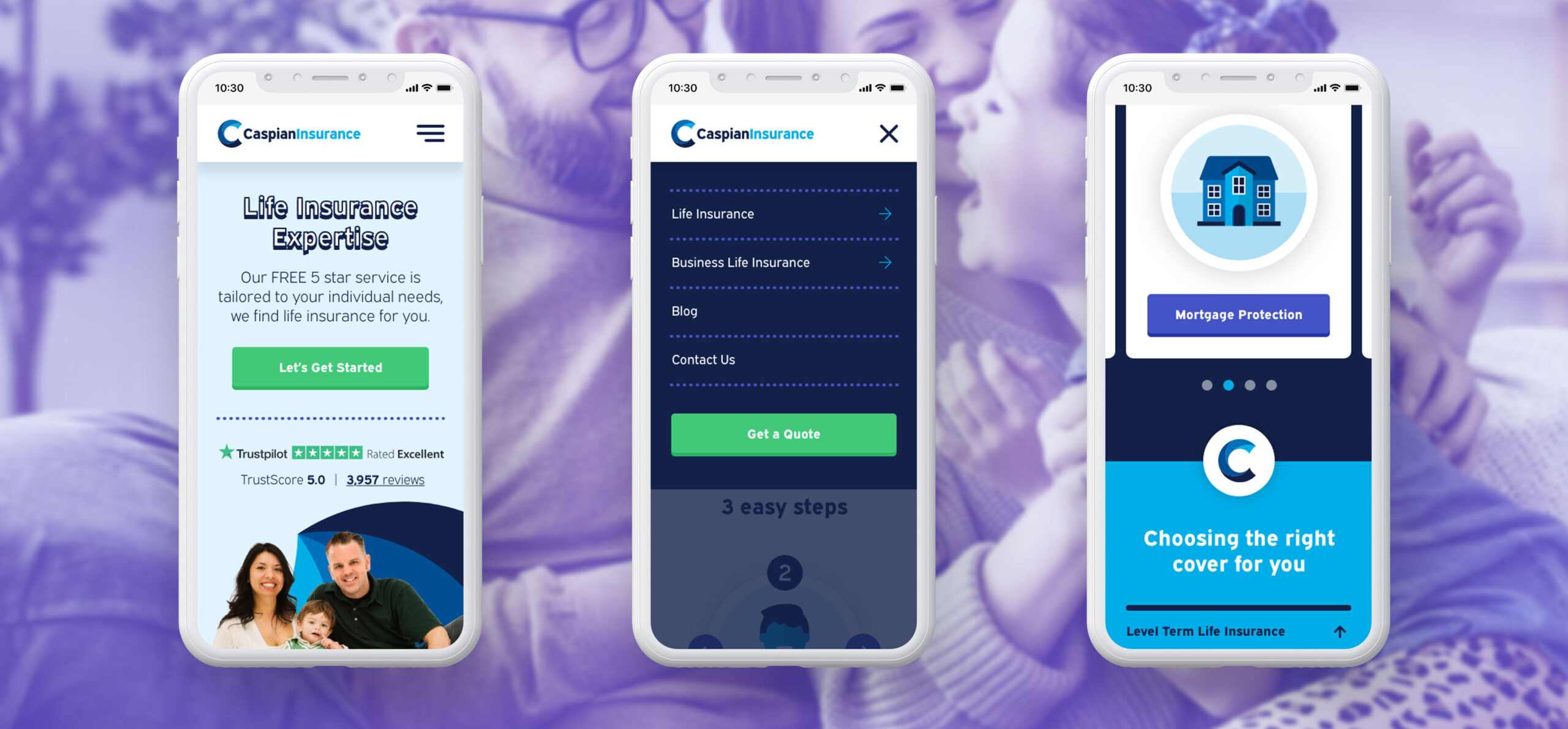
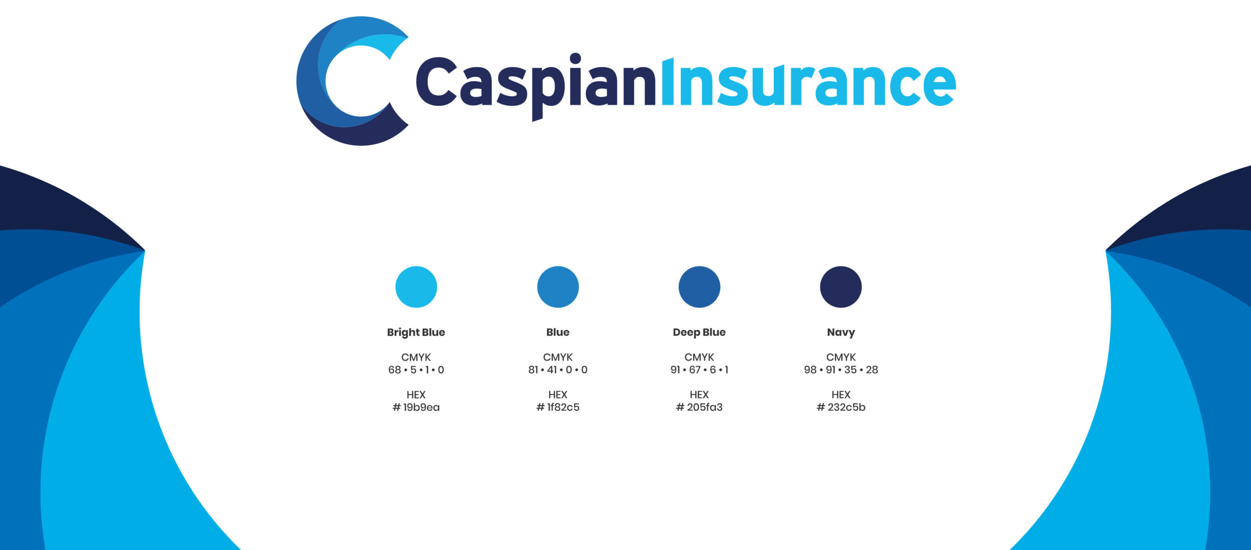
Refresh the current logo and update the website of a life insurance company, Caspian Insurance. Caspian’s branding was dated and in need of a refresh. The same colour palette of blues was to be used but with some brighter blues added to liven it up and help it stand out from their competitors. With a new brand they needed a new company website to match, as well as stationery and all marketing collateral. The tone of voice and look and feel needed to be seen as serious but also inviting to prospective customers of their life insurance services, rather than dull and corporate as it once was.
The Result
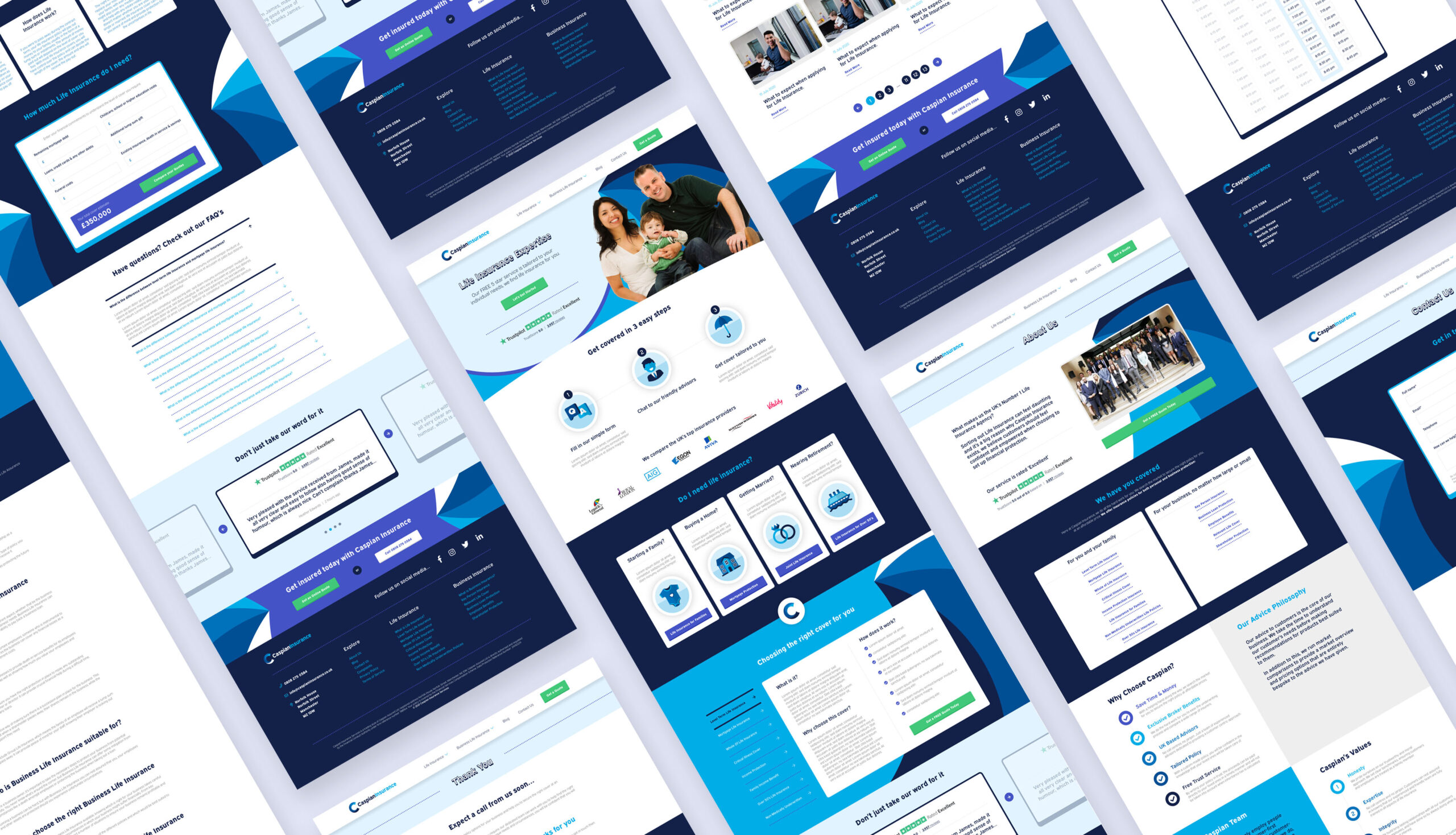
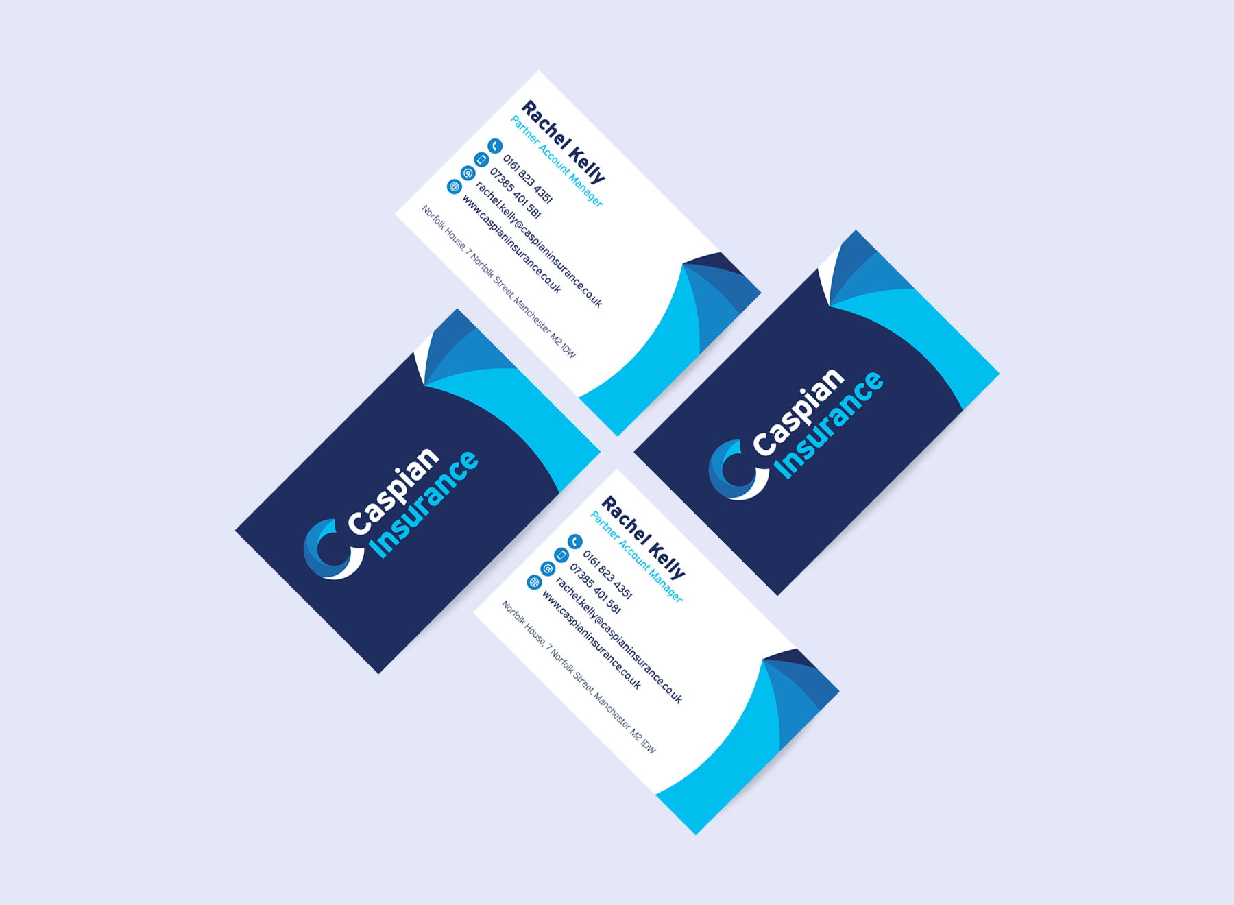
Just as the former, the new logo incorporates the company name with an illustrative brand mark. The previous logo used a dated serif font, which gave a very stiff and corporate tone of voice. The font used now is “Expressway” and is san-serif, which is modern and inviting, yet still trustworthy. I bastardised the “I” and the “U” slightly by creating an angle at the top to subtly match it to the descender of the “P” giving the logo a connected feel when stacked. The brand mark uses the letter “C” with a contemporary swirl inside, which is homage to the old brand mark, but executed in a slicker way. The swirl is representative of the Caspian Sea and the waves in the water. The new website uses decorative elements of the new branding, specifically the swirl from the brand mark, to create visually striking graphics as a way to make up for their lack of company photography and was a way round not having to saturate the website with overly used generic stock imagery. For this reason I have also drawn bespoke illustrations to highlight services used throughout the website, instead of basic iconography. The CTA uses a bright green to contrast against all the blue and visually stands out well so a user can instantly see what actions are important.
