Jersey Street Social Club
Branding & Website Design
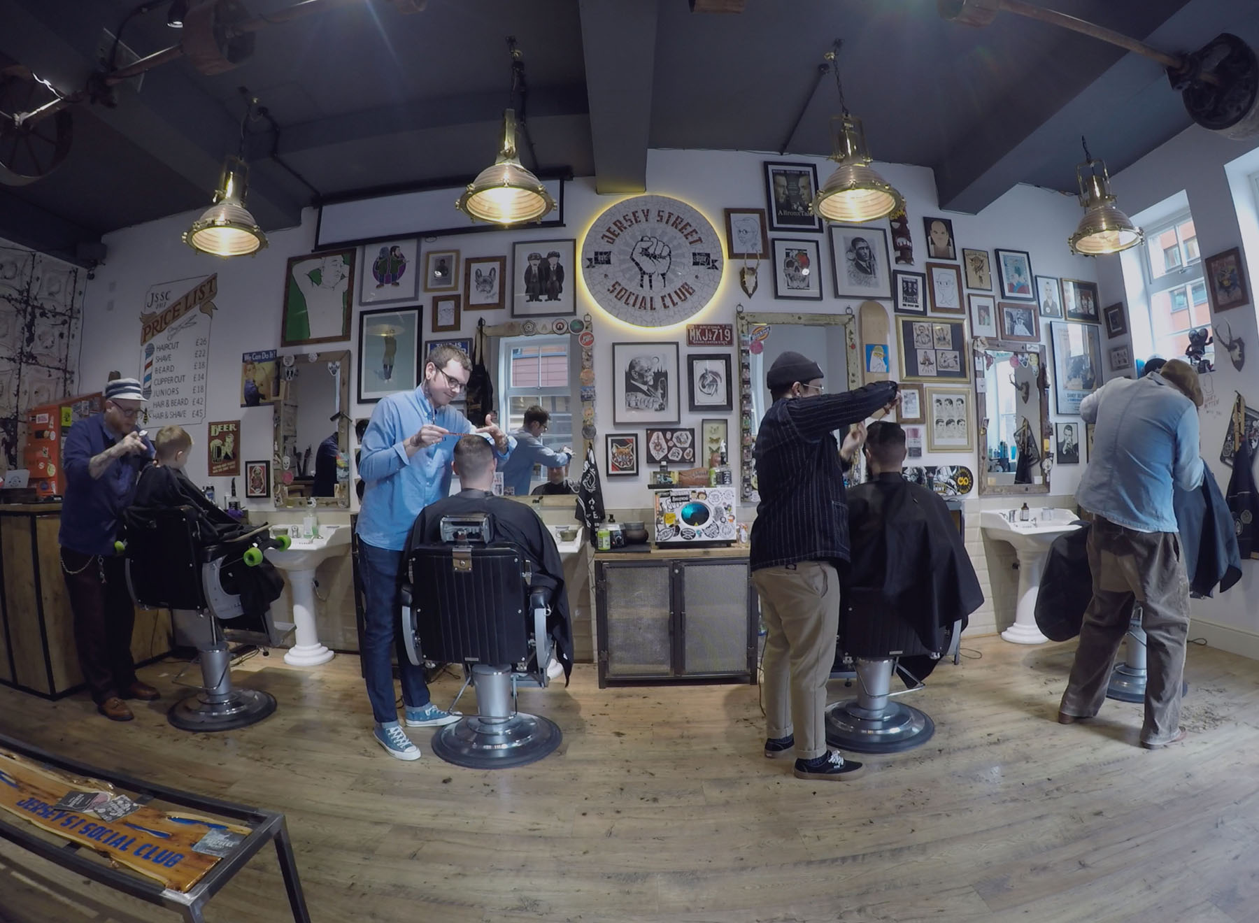
To create a logo for a new barbershop and social space set in the industrial heart of Manchester’s Ancoats. They wanted a fresh new brand and website to reflect the quirky hipster style of their store, along with marketing collateral to get the business up and running. They were after a striking, bold logo using a red colour palette and to have Constructivist influences.
The Result
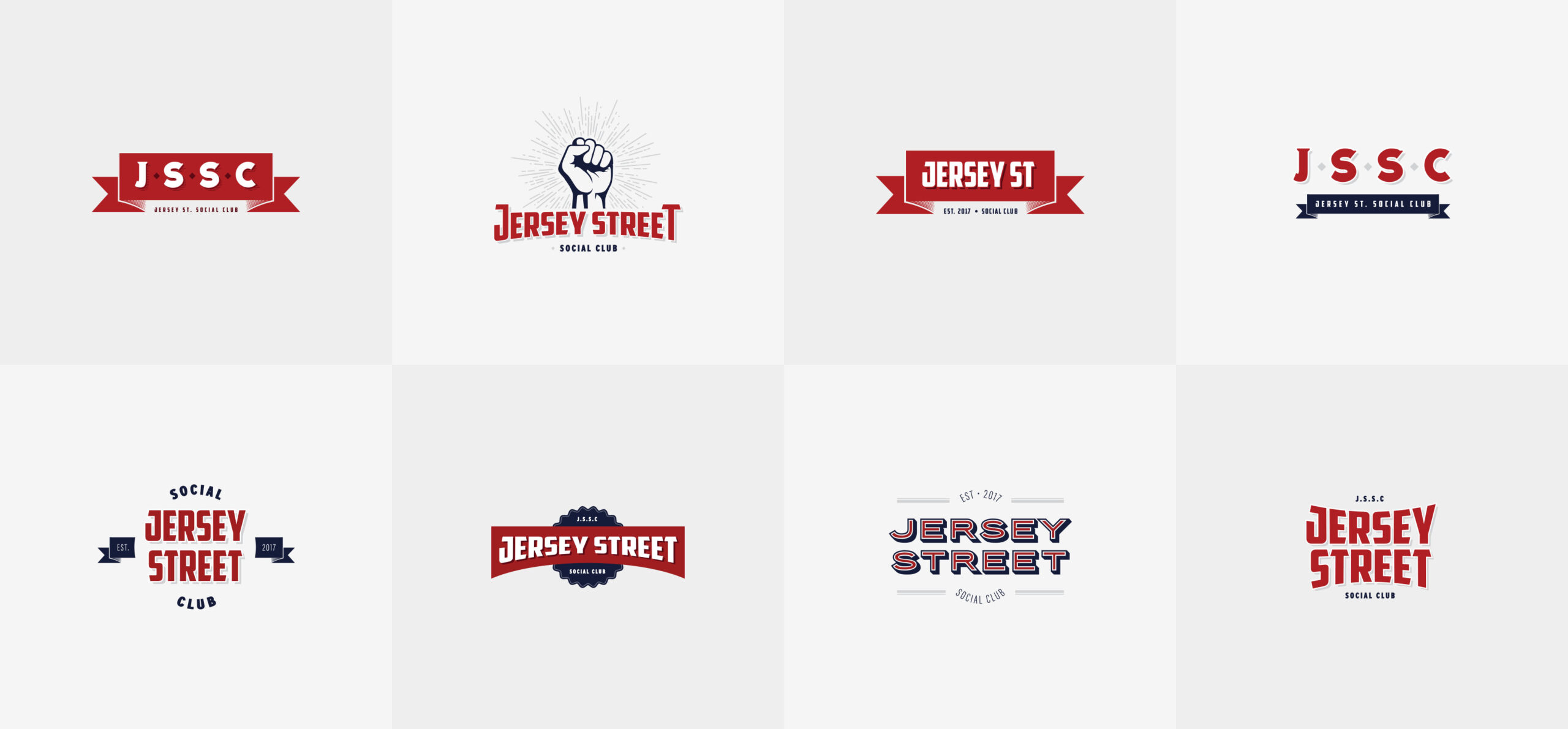
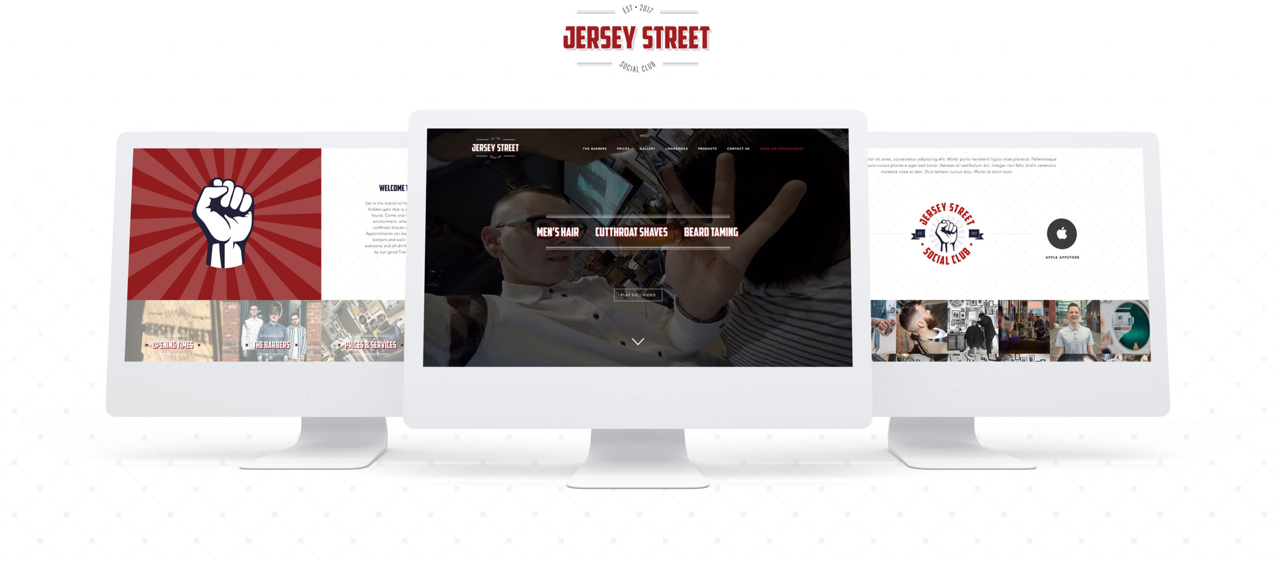
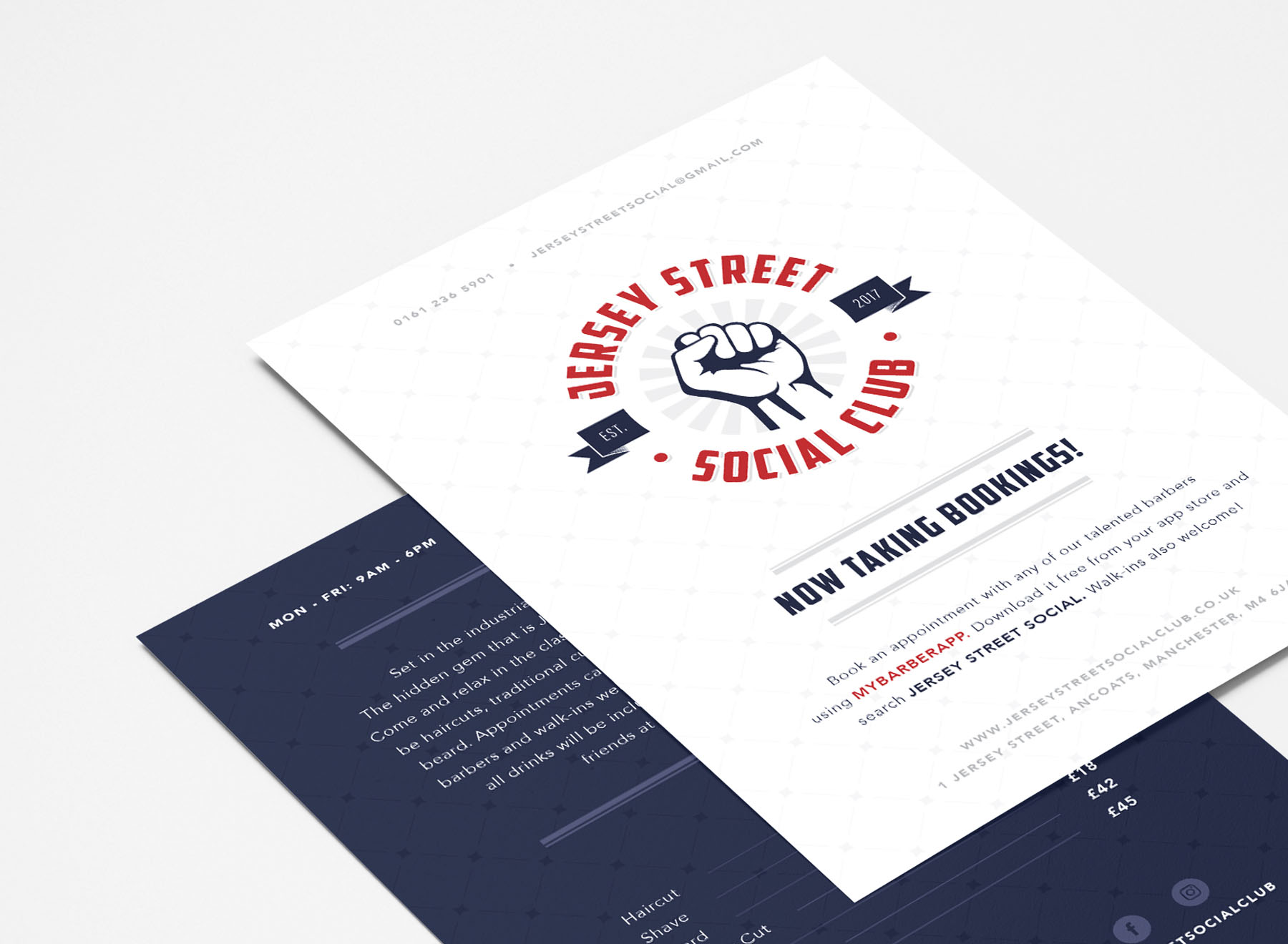
After many concepts the client decided on having 2 types of logo he could use in different scenarios. The main logo uses the Constructivist influences they asked for in the brief, it incorporates a fist illustration in a badge and ribbon style layout, with a red and navy blue colour palette. The secondary logo is a simpler, purely typographic version, which is used on the website and for more subtle environments. You can see some of the runner ups below, they were too much fun not to show. The website needed to advertise the new barbershop and its barbers, as well as make people aware of their free app so customers can make bookings online. The website is bold and blocky and uses the same red and navy blue theme with elements of the logo carried throughout. The sunburst element is used on the CTA blocks and rotates to create engagement and bring focus to those important sections.
