Lime Jelly Design
Branding
This is an ongoing personal project for my freelance company, Lime Jelly Design. I wanted a fresh and fun brand to reflect the work I love and my personality. The brand name has as a little anecdote which always makes me smile.
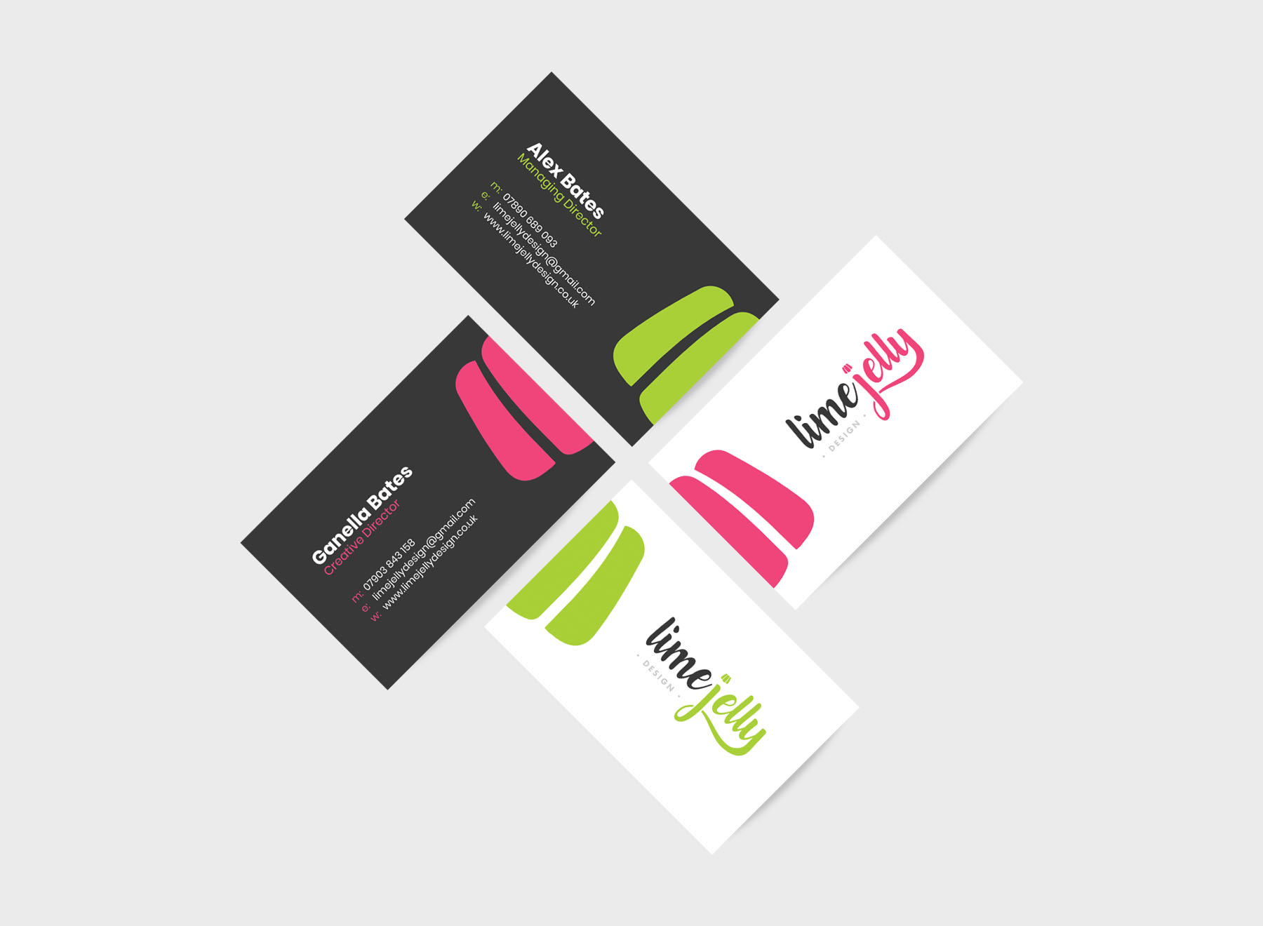
The Result
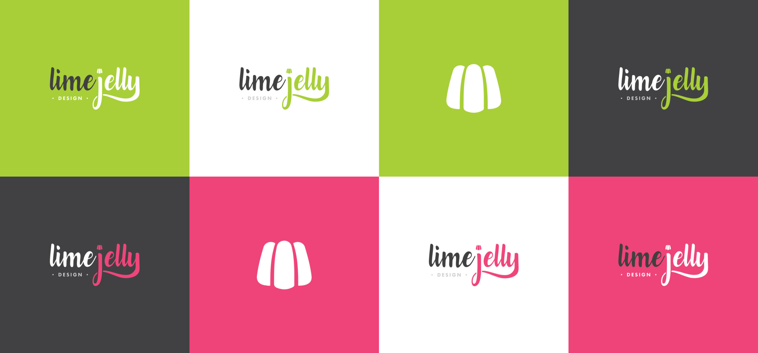
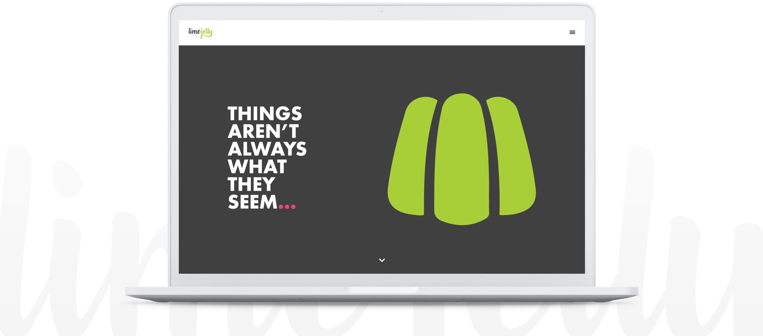
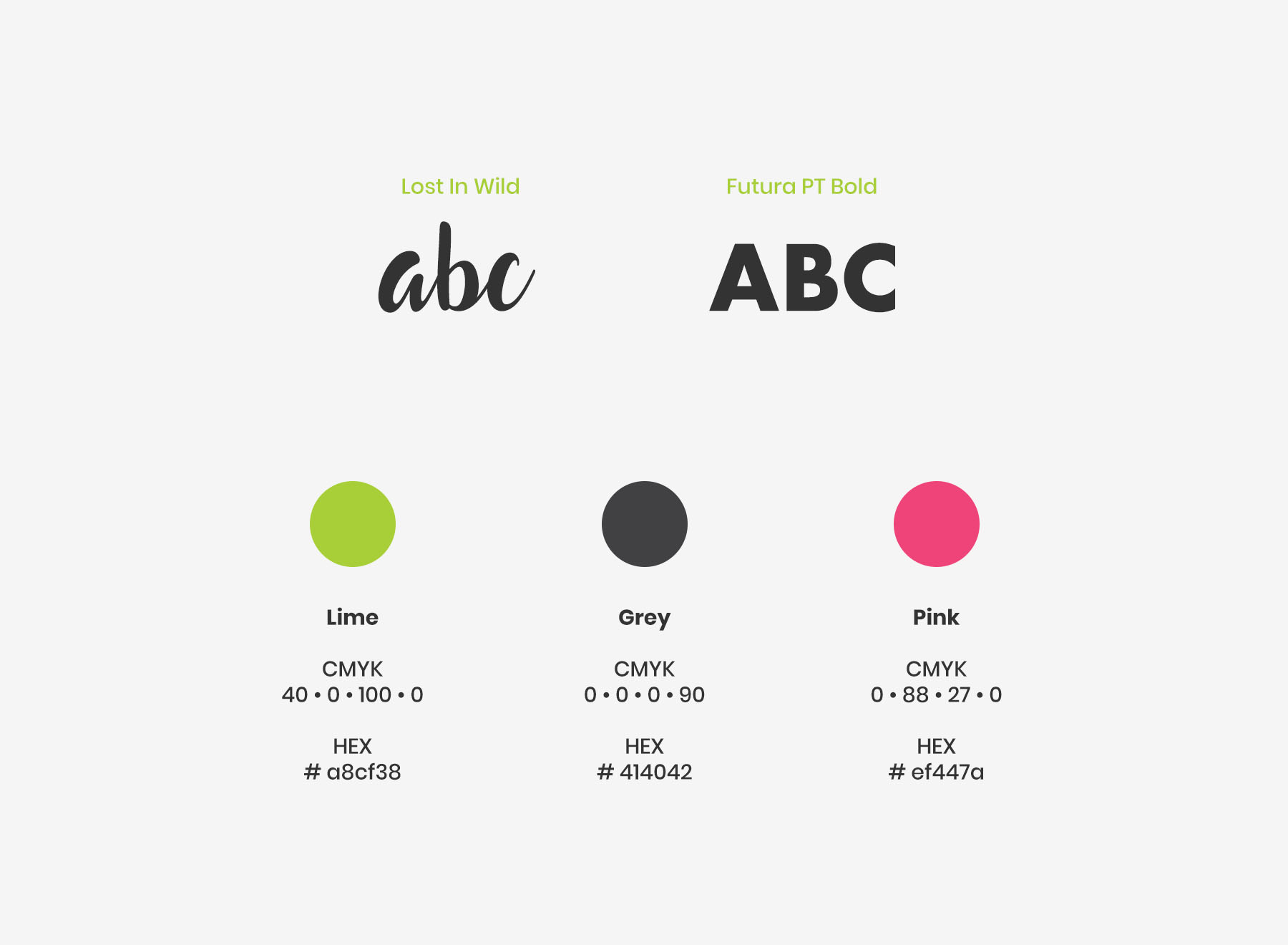
The logo is predominately typography based and uses a fun, calligraphy-esque font called “Lost In Wild”. I bastardised it slightly to connect the “J” and “Y” as an extra little quirk, plus added a tiny little jelly icon to dot the “J”. The jelly icon can be used as a stand alone brand mark when the full logo isn’t being used, or as a decorative element on the website or on marketing collateral for example. There are two different colour ways, lime green or cerise pink, these represent two different flavours.
