Weaveability
Branding & Website Design
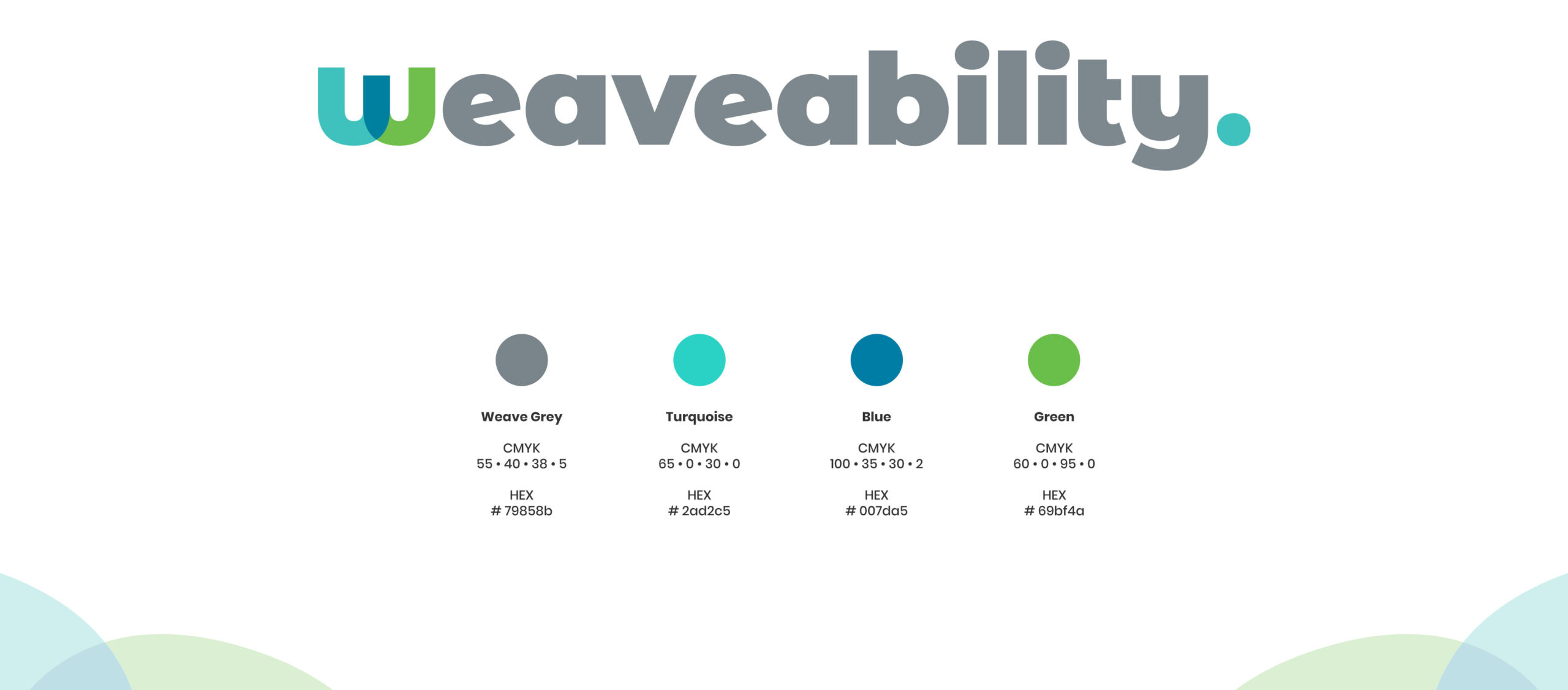
Refresh the current logo and update the website of IT company, Weaveability. The current brand was tired and needed livening up. The same colour palette was to be used and it needed to look like it was still the same company, so couldn’t be wildly different. We didn’t want to confuse current customers, but needed the logo to be brought up to date, as well as a website, stationery and all marketing collateral. The tone of voice, look and feel needed to be seen as serious and reliable but also fun and almost agency-like, rather than overly corporate as it once was.

The Brand
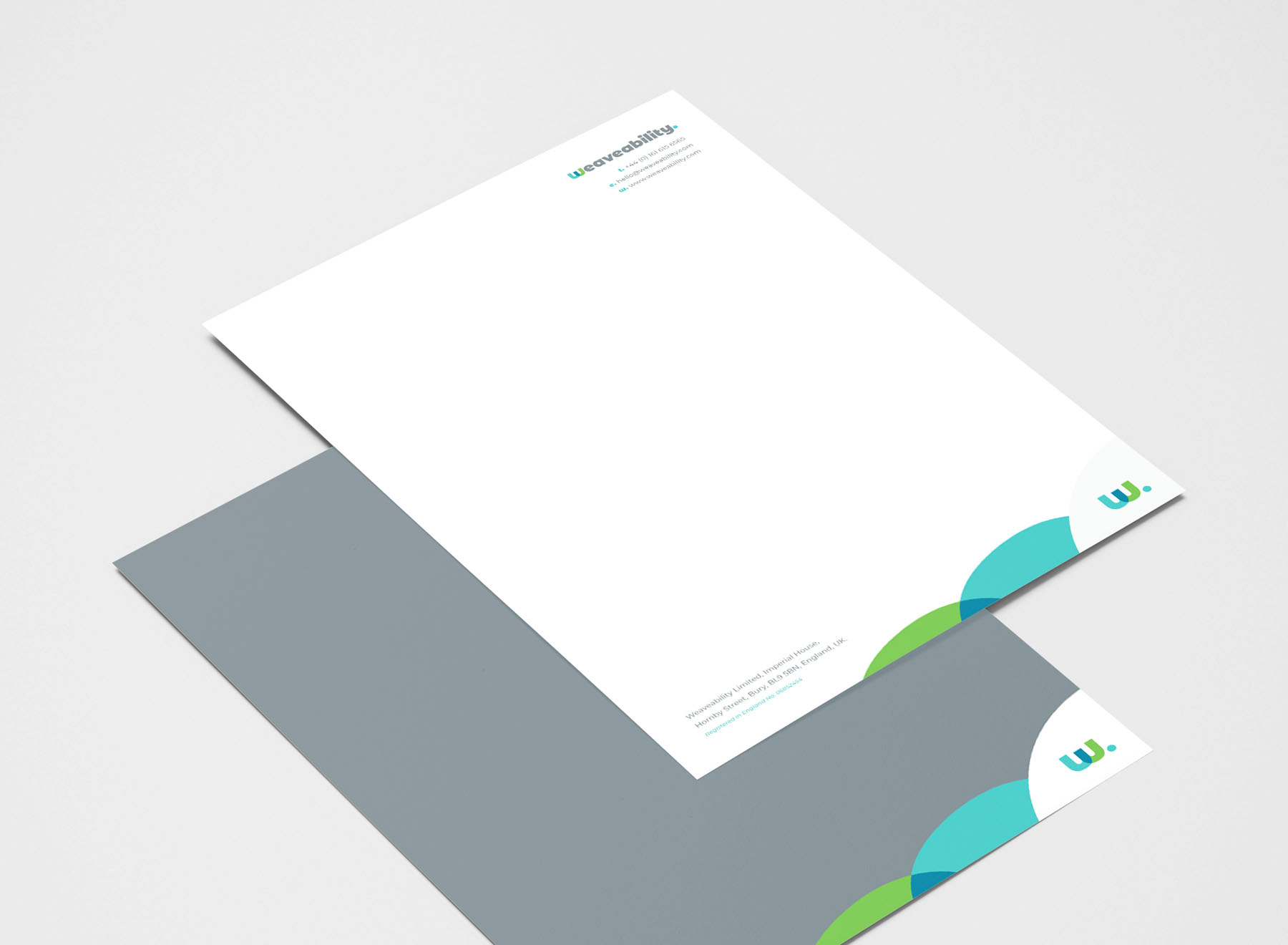
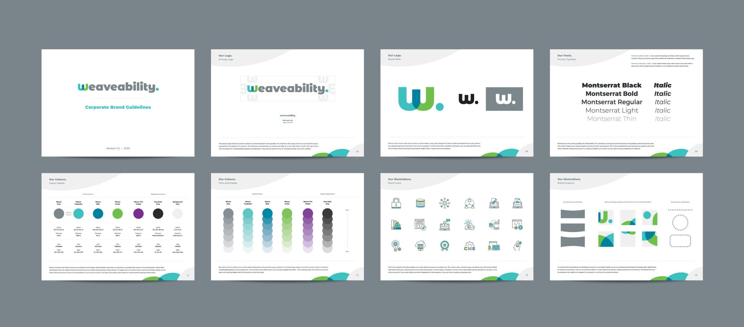
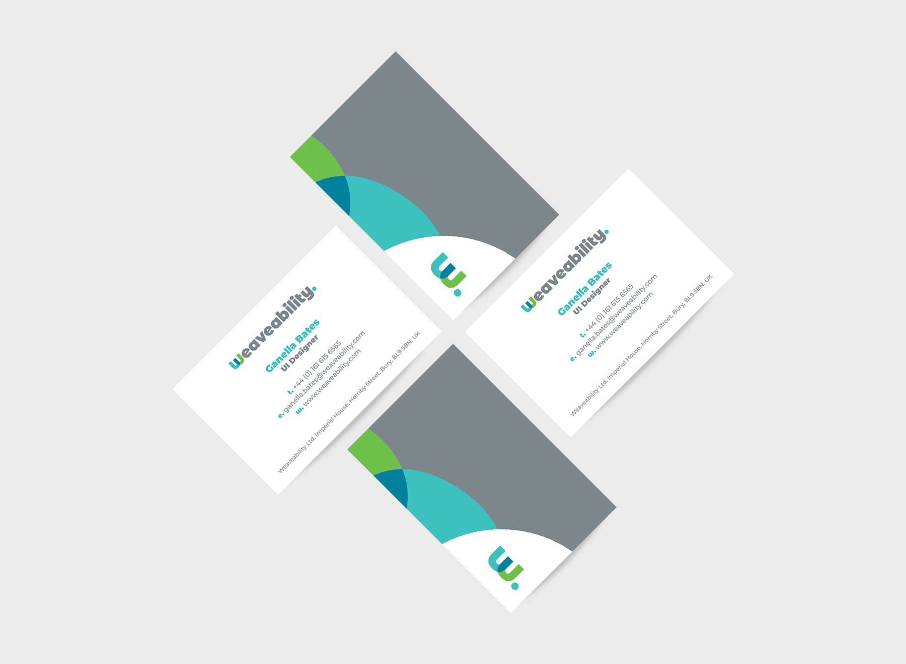
Just as the former, the new logo is fully typographic. The font was updated from “Calibri” to “Monserrat Alternative”, which is much more modern and fun to work with yet still highly legible and trustworthy. The main focal point of the Weaveability logo is the “W” it has been formed using two shapes joining and “weaving” together to portray the way the company’s internal teams work together to bring their customers joint, full service IT solutions. When the logo cannot be used in full then the brand mark of just the “W” will be used. The brand mark is bold and striking, it can be used in abstract ways to produce fun and graphical designs across the website, stationery and other marketing collateral.
The Website
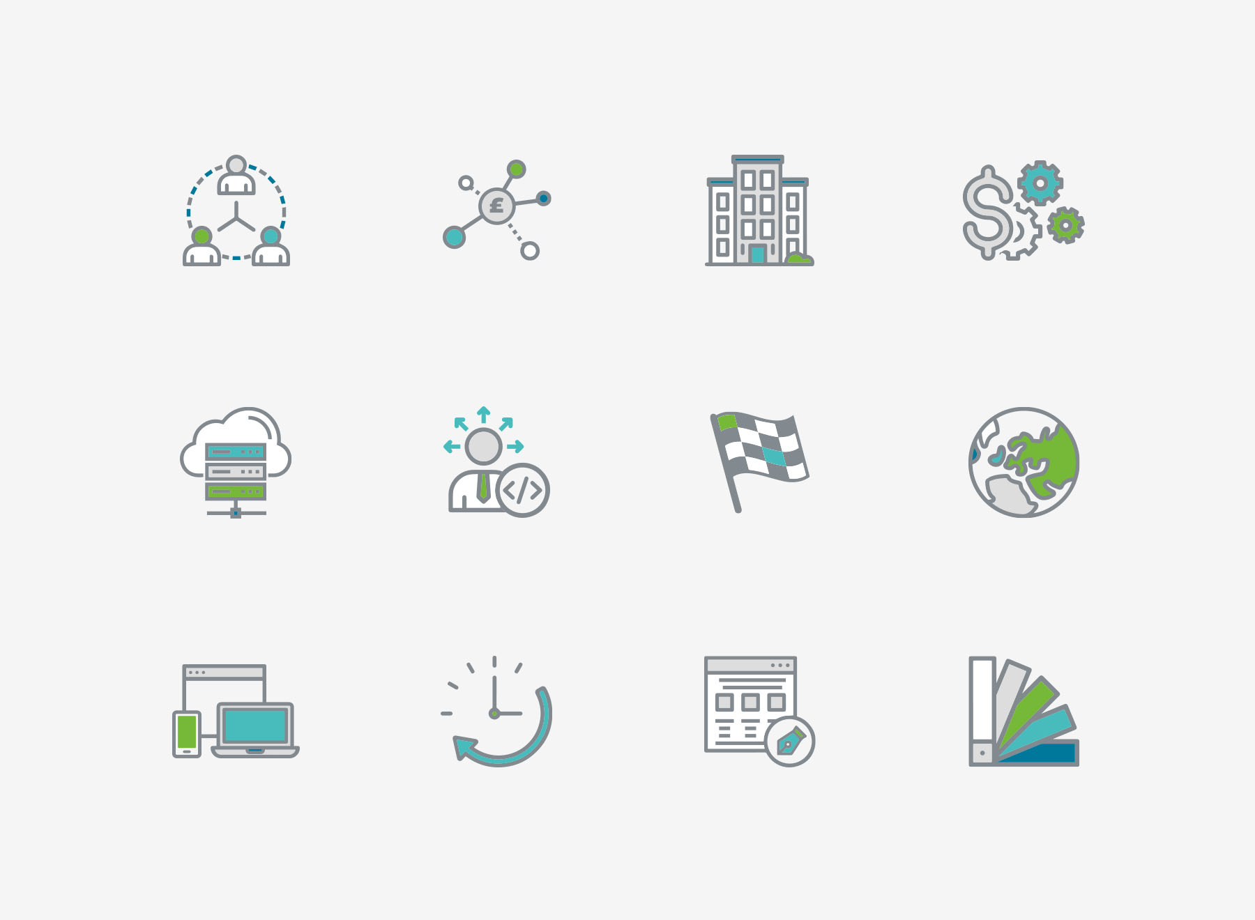
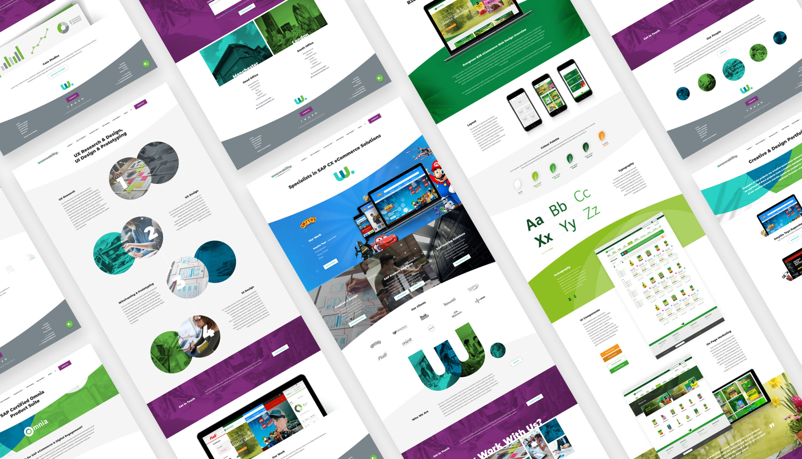
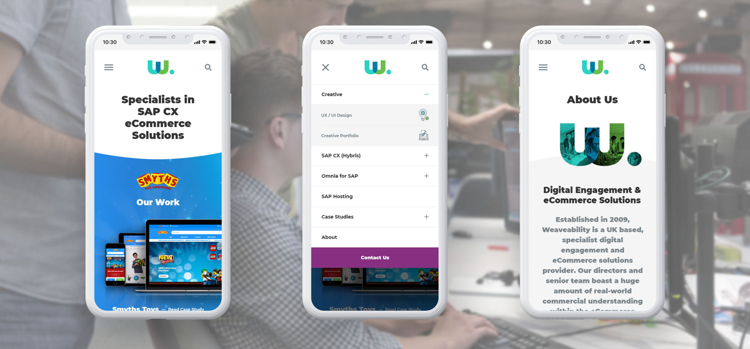
The website incorporates the brand mark heavily to create decorative abstract elements across the web pages. It is very bold and brightly coloured but still retains a look of importance and seriousness. Content has been structured in a bite-sized way so users aren’t bored of reading reams of text and stay engaged. Curves from the logo have been brought into the branding of the website as a fun way of dividing up content. As Weavability didn’t have a photo library to work with I decided to keep the photography minimal and use a more illustrative style across the website by using bespoke icons.
